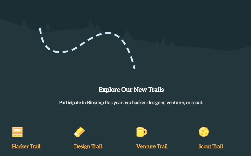

For Bitcamp 2018, I returned as the director of design. As a hackathon, Bitcamp prides itself on being welcoming to people with diverse interests, especially design. This year, we tried to focus in on this by developing "trails" - different programs or ways to participate in the hackathon for people with different areas of expertise. I created the Design Trail, and had a wonderful team, so I functioned in more of an art director role. We focused on branding that emphasized this trail theme.

Our website used map-style trails to indicate progress and reinforce the idea of a trail, as well as calm landscapes to push the welcoming camp atmosphere of Bitcamp. We created pixel art reflecting many of the activities that occur at hackathons and used them throughout our branding in order to create a consistent theme and emphasize that there are many ways to participate.
I came up with this concept, did the layout (except for some parts added by the development team) and animation, and art directed the actual background art. I then developed the background art into a motif used for all the rest of the promotional materials of the event. This was primarily a graphic design project of making a visual representation of the event that fit into the existing style guide, but also required some UX thinking to figure out a way to create an animation that wouldn’t distract from the content but would deliver our message in an experiential way.